A LOOK AT SOME OF THE NEW LEVEL-MAKING FEATURES FOR BRIGADOR KILLERS
For May’s update on Brigador Killers we’ve decided to talk about something many of Brigador’s modders will be familiar with: the debug panel.
For those not familiar, if you press F1 at any time in Brigador: Up-Armored Edition an overlay window appears that looks something like this.
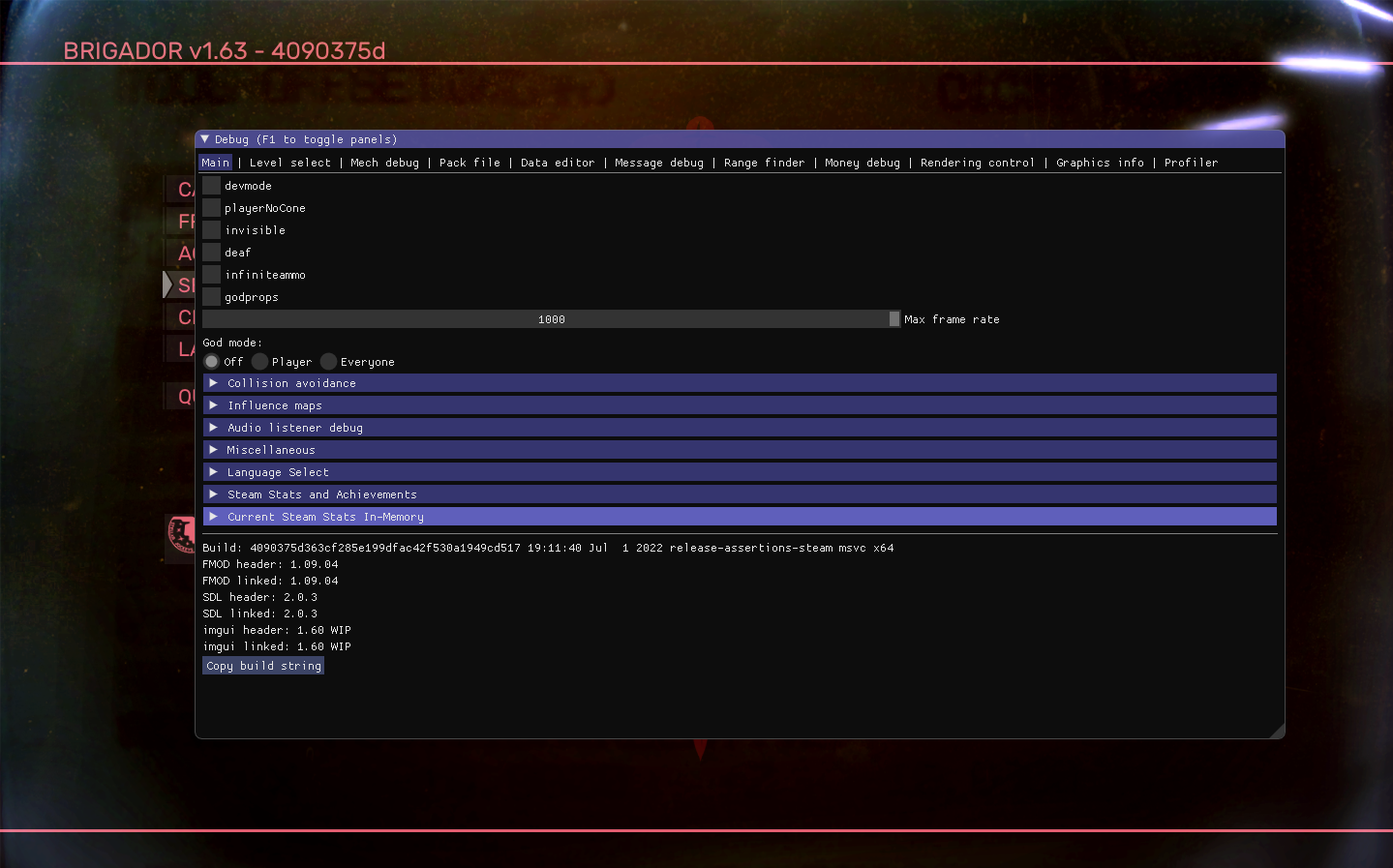
In BK, the debug panel has had some work done to it…
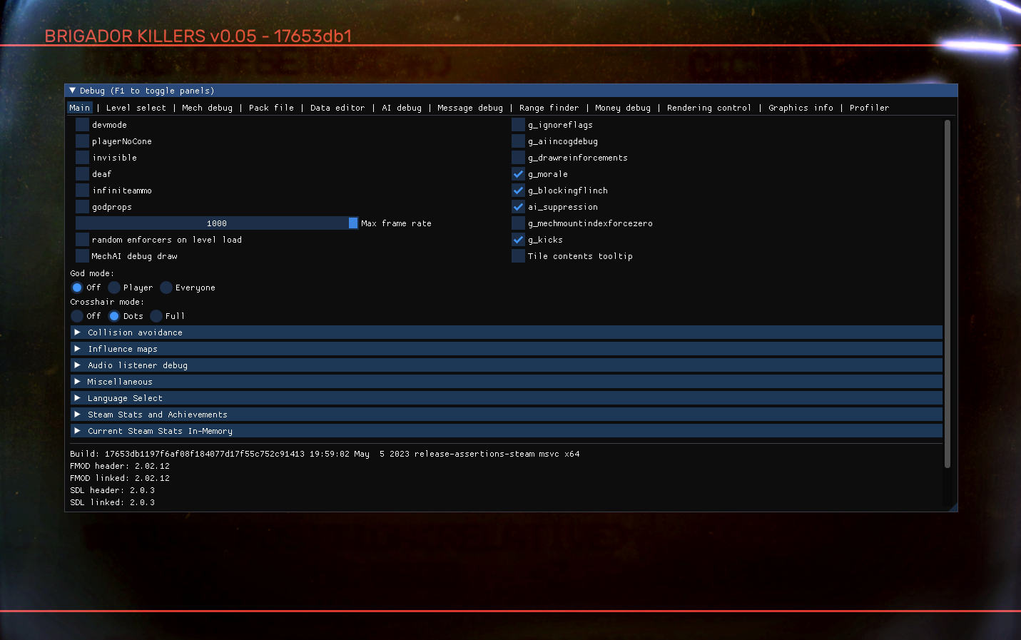
…so we’re going to highlight three of its new features.
[For those wondering, yes, this is Dear ImGui by Omar “ocornut” Cornut, which is used by a lot of other game developers in their games though it’s typically not made accessible in the public versions of those games.]
Our usual caveat as ever: what you see is still a work in progress and not everything in this article’s screenshots are necessarily representative of the final product. If you're having trouble viewing the screenshots, try right clicking the image and opening it in a new tab. 
🔍Tile contents tooltip
Let’s say for instance we’ve laid out a level and need to edit the features of a particular structure (or “prop”) like this fenced-off enclosure in a Brigador Killers test map.
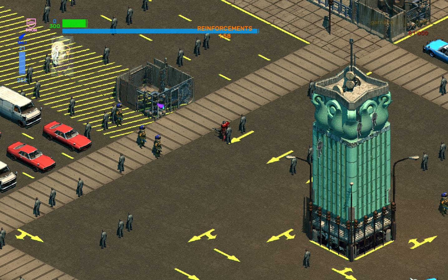
If this were our previous game and we didn’t know what the prop’s .json file was, we would typically refer to the version of the same level in Tiled, which is the editor we use to make levels in both Brigador and Brigador Killers. Over there we click the prop and it’ll show us its file path…
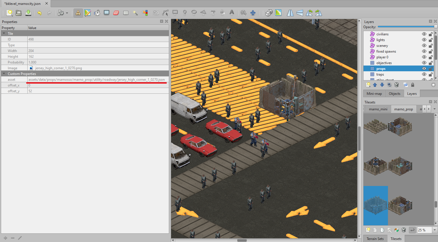
…And from there it’s just a matter of alt-tabbing back into the game to look up the same file path in the pack file tab, and then inspecting it via the data editor tab and we can set about configuring the prop to our needs.
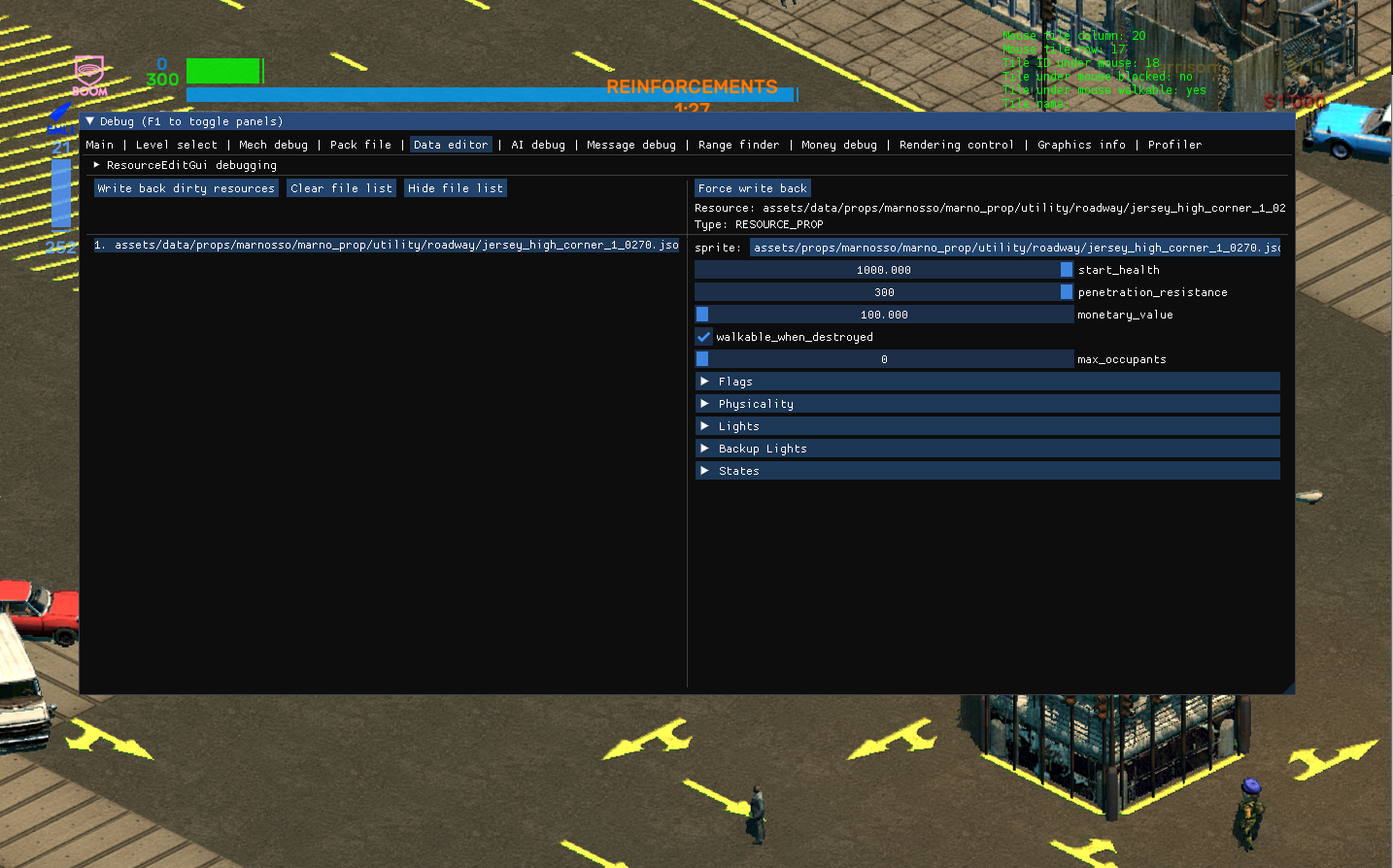
Simple enough, but it can be a bit clunky, particularly if you have to work with multiple rotations of the same prop in order to, say, make sure the strength of a structure is unified across all variants of that asset. This could get a bit complicated when it came to what we call “prop stacking”, which is placing two props in the same tile but using different layers in the editor.
[Sidenote: this hasn’t historically been a huge problem for us, though it is one of those time wasters in game development that might seem tiny, but adds up as more and more assets get added to the game.]
The Tile contents tooltip provides a solution. By enabling it, whenever our mouse cursor moves over any prop in a level, a small tooltip window will appear.
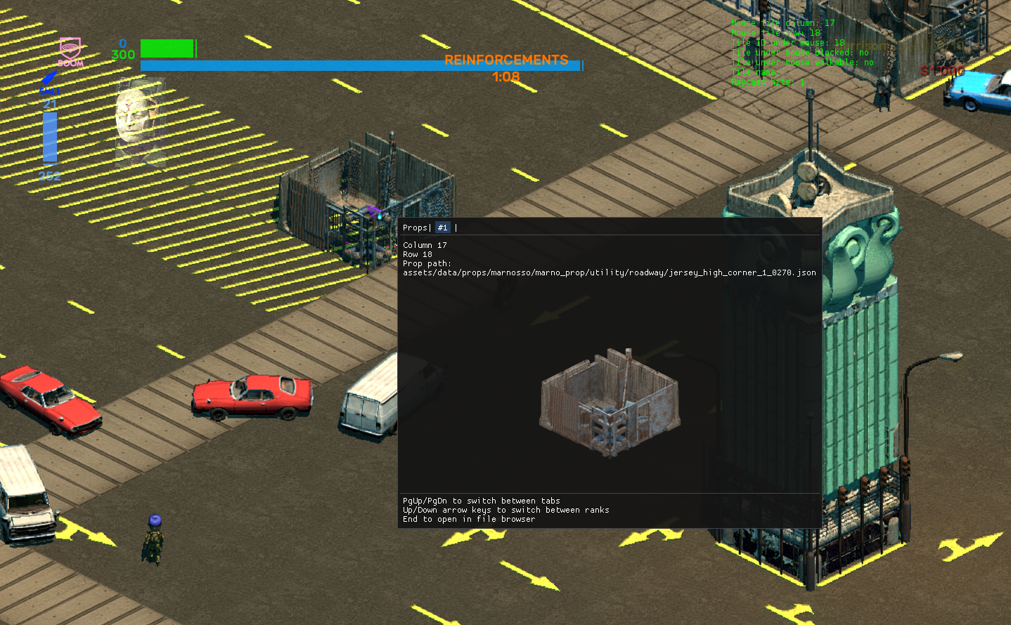
This tells us what props are occupying that tile, what the prop path is and allows us to immediately look up the asset in the data editor by hitting End on our keyboard, which cuts out all that of alt-tabbing and manual typing mentioned above.
In addition, if we in fact have stacked two props on the same tile, the tooltip will still tell us! Let’s direct our tooltip’s attention to this set of light poles inside a topiary…
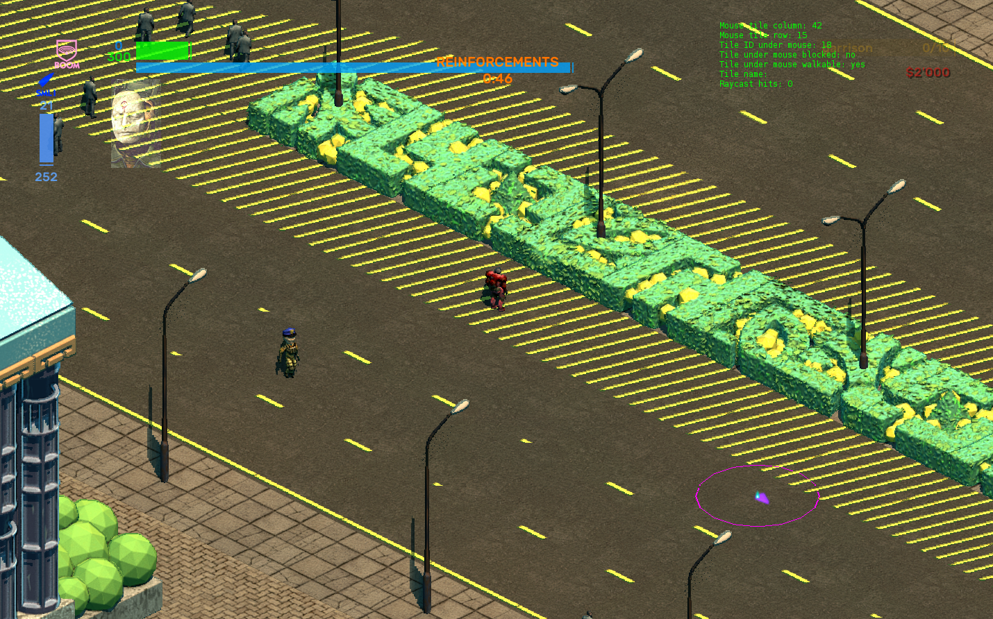
Mousing over with our tooltip and using the arrow keys will let us toggle between the props on that tile, showing us the details for both the topiary and the light pole.
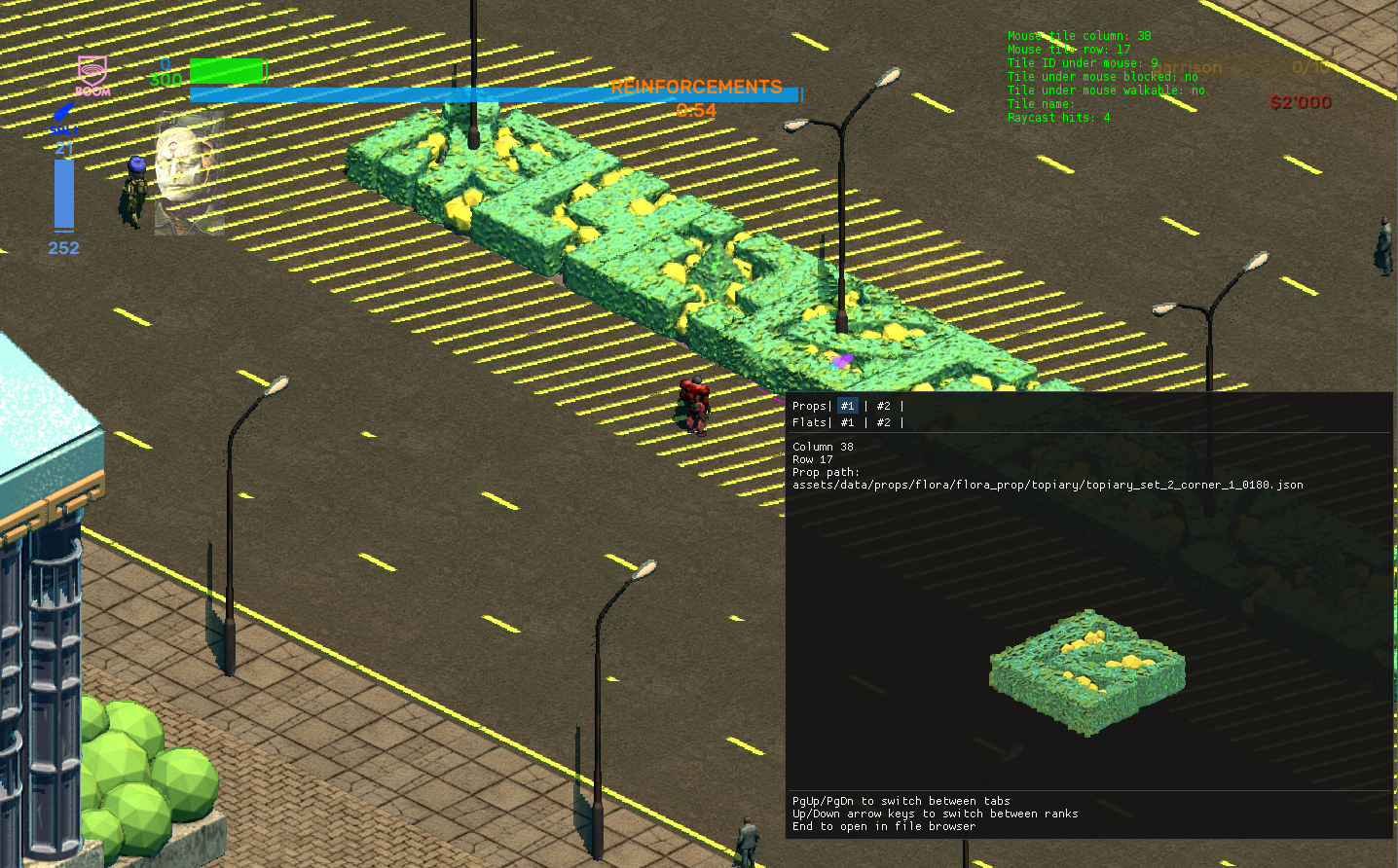
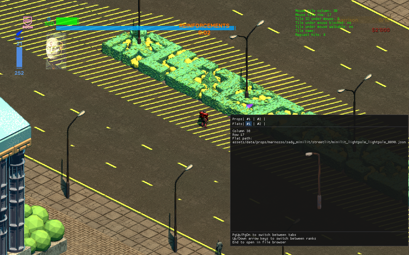
From a development standpoint, this will save a huge amount of time because of the increased volume of props that we’re making for BK. Keen-eyed modders might also have noticed the green text that appears in the top right of the screenshot, which informs the user whether the moused-over tile is walkable or not.
🚓Patrol routes
In the Mech debug tab, two new radio buttons have been added:
- Select patrol origin
- Select patrol endpoint
In order to make use of it we select a mech (“mech” here means any NPC that has some kind of active AI state unlike a vehicle like a panel van), indicated by the green triangle underneath the placeholder Dave-with-a-cophead. If units are currently moving about we can pause the action with devmode enabled. With time frozen we can click the desired patrol origin and end point for the chosen mech within the game.
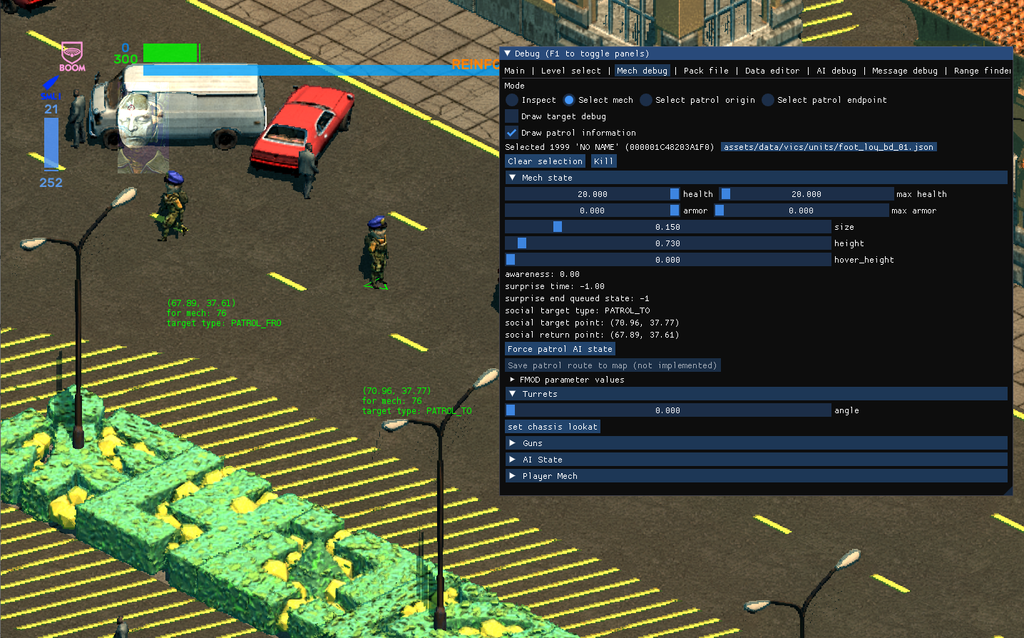
Inside the game we are limited to just a start and end point. Outside of the game we can set more complicated patrol routes via Tiled. If we click Force patrol AI state and unpause the game, our newly assigned mech will dutifully bounce between both points in the level, visualized here by the orange debug lines.
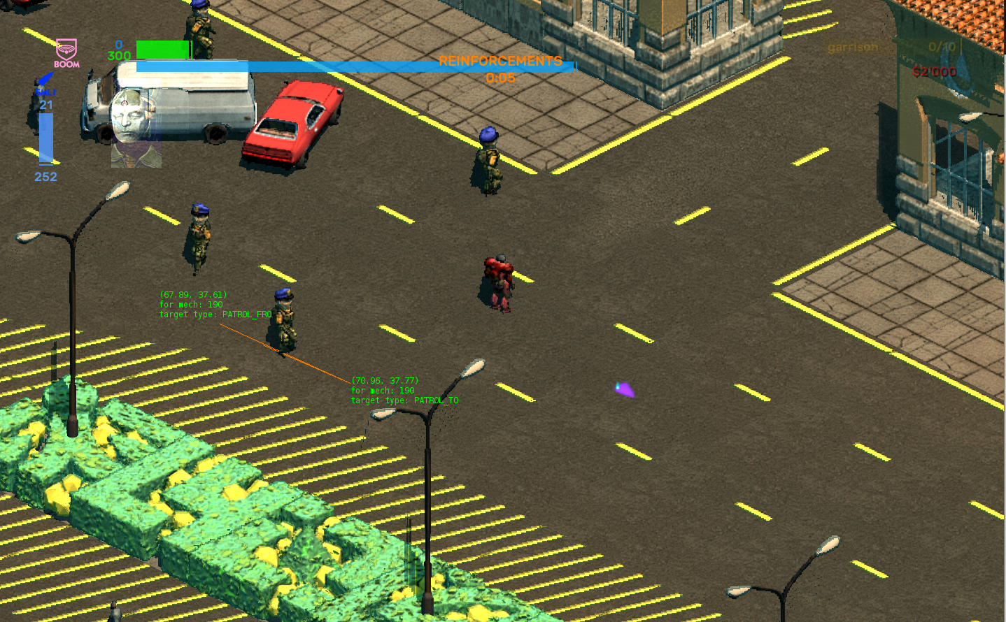
Unfortunately we can’t force this new patrol information permanently within the game. It has to be done outside of the game in Tiled, where we have to manually specify the patrol behavior for a placed unit. However, having the patrol feature immediately testable within the game let’s us:
- See whether the mech can patrol to and from that point or not
- Get the coordinates for those two points that we can take over to the Tiled version
As you might expect, this is going to allow us to create more interesting combat encounters, particularly in light of the third feature.
🚶♀️Civilian socializing
This one’s complicated, and this screenshot is probably not going to help either, but bear with us.
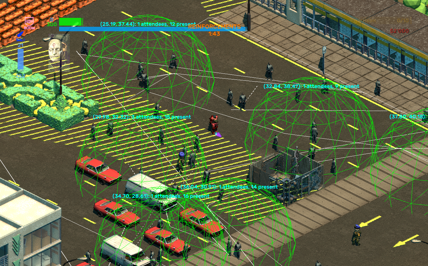
What you’re looking at is the debug draw of the social paths. Put simply, civilians have new socialize AI states. In the case of the above, the green hemispheres indicate areas of “socializing”, while the white lines indicate civilians searching for such areas and the path they’re taking to get to one.
When a mech enters the social state, it will randomly pick another mech, internally called its "friend". The friend's current position will be chosen as a meeting point (or green hemisphere) and it too will enter the socialization state. Futher mechs that enter a socialization state and choose either of the currently "socializing" mechs as a "friend" will converge to that meeting point. After an amount of time passes, these civilians will search for another place to socialize. In the process of writing out this post, we had left the level running a bit too long in the background and 99% of the test level civilians ended up all grouped together.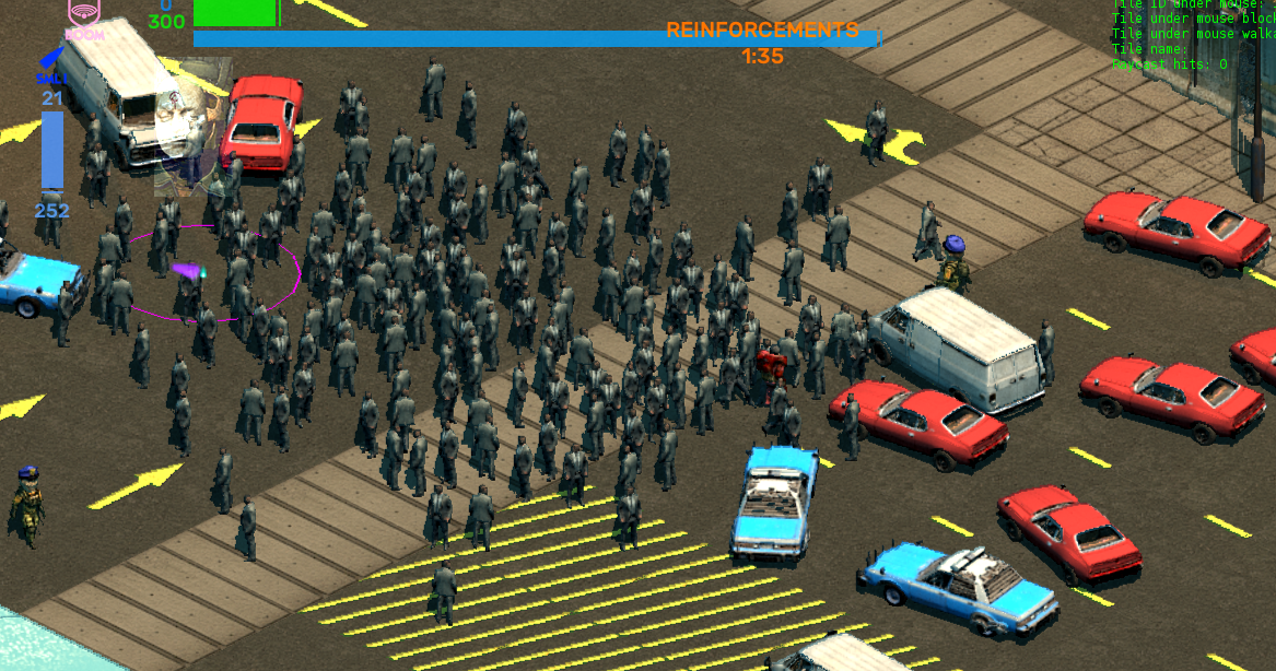
Civilians dynamically moving around in such a manner goes a long way to making levels seem more alive but it’s not the only thing. Not featured here is the ability to make props that are “socially interesting” and not just to civilians. Other on-foot NPCs like cops are also capable of the social AI state.
What does this potentially mean from a gameplay design standpoint? One possibility is it means we can place entities in levels that will draw the attention of NPCs and cause them to gather in particular spots. Maybe it’s a fast food restaurant, maybe it’s a police checkpoint, or maybe it’s something the player can use to create a diversion within a level…
Whatever form it ends up taking, we know we’re excited to see what our community of established modders gets up to with these features alone.

Did you know that Stellar Jockeys has a merchandise store? If you’d like to help fund our development, consider purchasing a pin, t-shirt or even an SNC Skull & Laurel Zippo™ lighter.

Get Brigador Killers
Brigador Killers
Isometric power fantasy
| Status | In development |
| Author | Stellar Jockeys |
| Genre | Action, Shooter |
| Tags | Cyberpunk, Dystopian, Isometric, Mechs, Music, Retro, Sci-fi, Singleplayer, Top-Down |
More posts
- BRIGADOR KILLERS: THE COMBAT BUILD16 days ago
- Beauty renders in the inventory screen26 days ago
- A Quick Look At The Latest Brigador Killers Build57 days ago
- Updating our plans for June87 days ago
- Your Reactions To Pilgrim Two Weeks OnMar 28, 2025
- Brigador Killers: Pilgrim Is HereMar 11, 2025
- Our Plans For The First Half Of 2025Feb 27, 2025
- Ghost LightsJan 30, 2025
- Meet the Teddy BoyDec 20, 2024
- Crash Test Dummies In Brigador KillersNov 28, 2024
Leave a comment
Log in with itch.io to leave a comment.