What Planning On Paper Looks Like
"It is important to use your hands, this is what distinguishes you from a cow or a computer operator."
The above quote is attributed to Paul Rand who was a famous graphic designer responsible for numerous corporate logotypes.
You may have already seen the allprops tour with Dave video that was posted several months ago which featured building assets from a few areas in Brigador Killers. If you haven’t seen it, watch the first two sections to get context for the rest of this post.
Neither the video nor the post for it over on Steam talked about the conceptual origins of those buildings for BK. To rectify this, we asked the artist responsible for a lot of the props in that video, Igor, to dig up some of their pencil and paper sketches for them along with penning a few thoughts behind each one. Right click the images and open them in a new browser tab to see them in greater detail.

slide_1_hrush
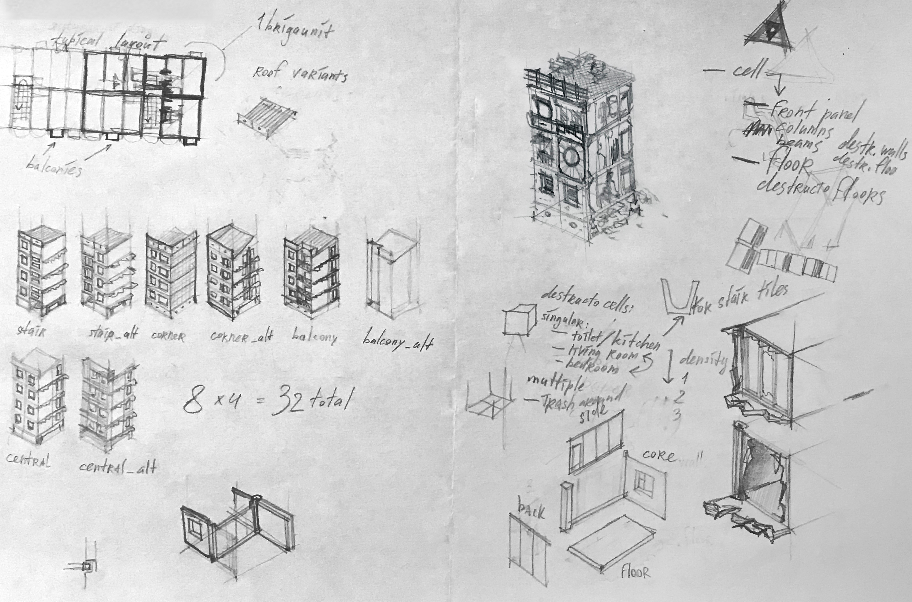
This was my first assignment on BK. The Hrush, short for "Khrushchevka", represents modest modular housing widespread in Sady districts. To make it I decided to simply appropriate the Type I-335 Apartment Block, a fairly ubiquitous design in the former USSR, and accommodate it for the game, both structurally and stylistically. It wasn't a particularly hard feat, since two adjacent cells can be believably downscaled to fit into one game tile. However, the Hrush also represents a particular shift in environmental design philosophy between Brigador and BK, a shift that will complicate things later on. Due to the doubled output resolution of sprites, we're now making most of the large buildings as sets of interconnected props, akin to the mansions from the previous game.
slide_2_hotels
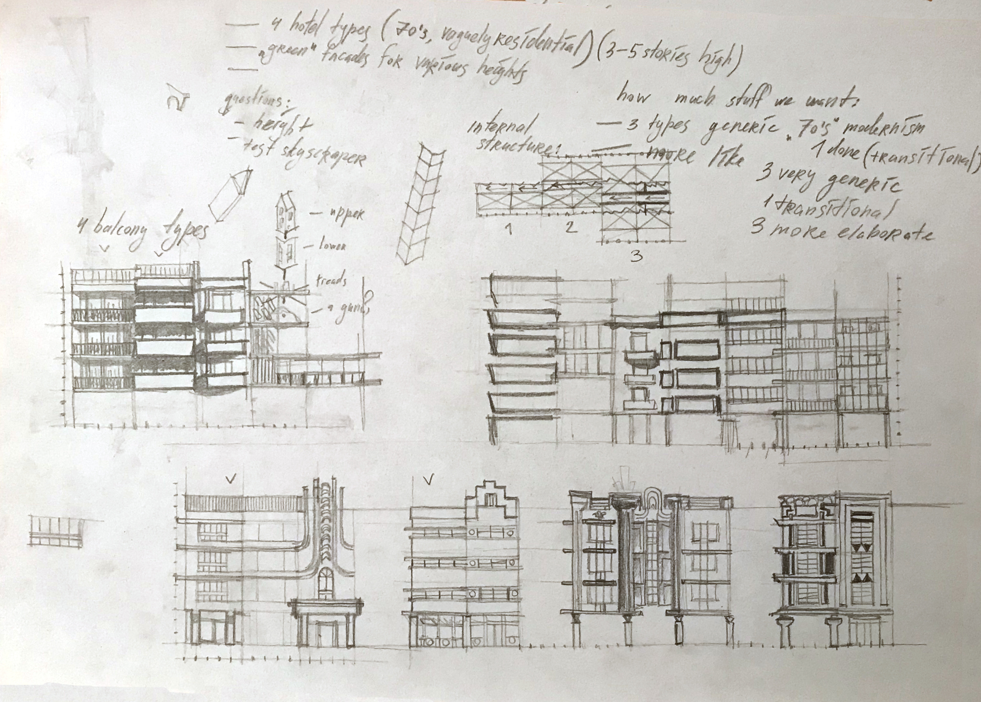
Nossian Hotels are essentially the Hrushes of downtown Mar Nosso, the design of which is heavily inspired by US hotel architecture of the 1950s-1970s, particularly that of Miami. Making them was a bit more involved, since the right balance should be struck between fancy and mundane elements – all to prepare for the eventuality of an unruly mapper overusing one particular prop style.
slide_3_offices
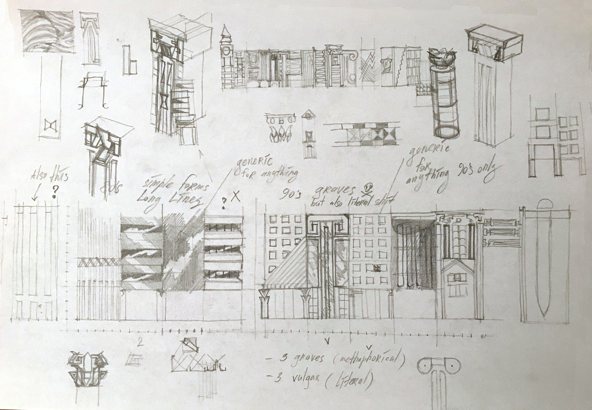
Mar Nosso Office Buildings. Glass and concrete. The 80s. The original design document proposed by yours truly said Nosso should feel open and uncomfortably clean, in contrast to the cozy misery of Sady. The first and the most straightforward idea here was to explore classic cyberpunk influences of Japan and Hong Kong. It clashed with Jack’s vision of a more neoclassical downtown. A compromise was found in turn-of-the-90s postmodern architecture. As with the hotels, a proper ubiquitous set requires many mundane modernist and internationalist elements, and US 80s office building architecture came in handy here. No need to go crazy yet.
slide_4_mcmansions
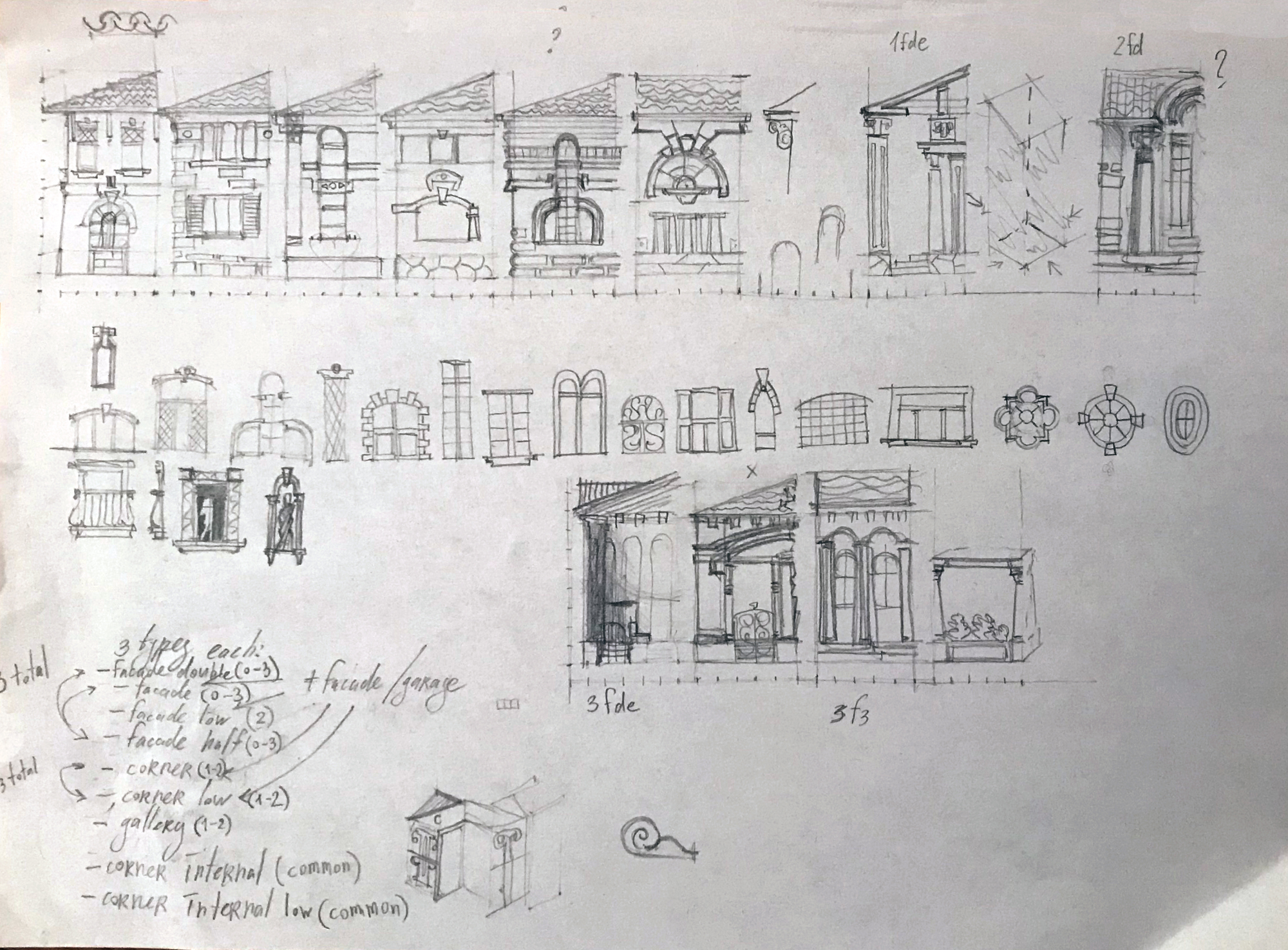
McMansions. You know ‘em, you hate ‘em. This was the moment where cracks in my psyche started to show. See, it's actually not that easy to make something as tasteless, as tacky and as stylistically inconsistent as a modern American McMansion when you have a degree in the field of architecture combined with very little experience of actually working in said field. This sheet represents one of my numerous attempts grasping at the plethora of contradictory styles and influences used by modern American architects tasked with building what are meant to be the most pretentious-looking houses in the country.
slide_5_office_postmodern
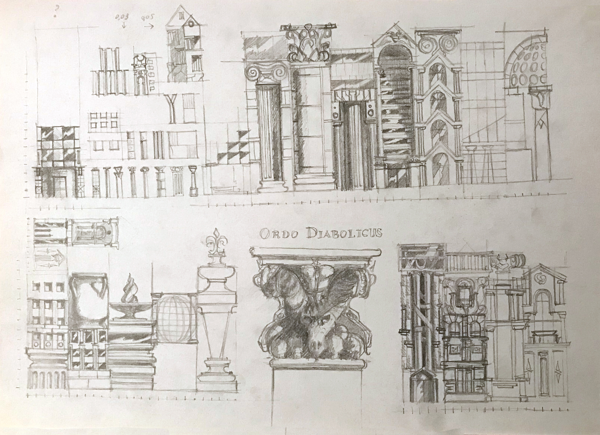
Postmodern additions to office buildings for Mar Nosso. This is hell. A particular late capitalist kind of hell fueled by late 80s pop/rock playlists. Go on. Just make a regular facade piece and put a giant bronze vase on its roof. Make a giant ionic column, but inverted. As long as it fits the 16x16 feet footprint and sufficiently blocks sightlines at the infantry level, anything goes. There Is No Law Here by Makeup and Vanity Set starts playing as teammates try to cheer me up.
slide_6_technotop
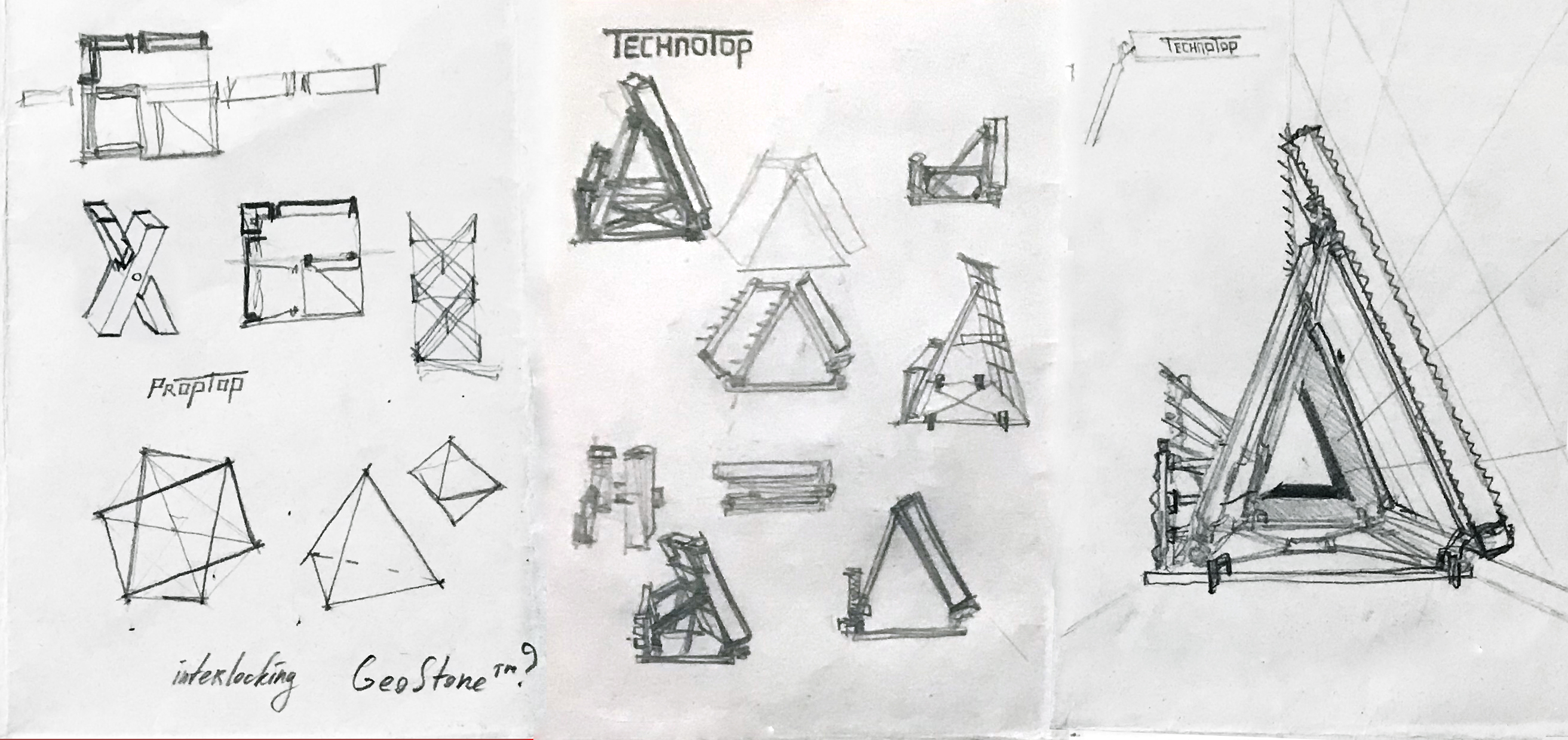
At this point I'm fully equipped to make products, not just assets. Remember that high topiary tile from Brigador’s suburbs/subwall_13-24 particularly liked by mappers? The one made of a combo of green wall and pieces of a Pak 40? Let's just make an actual thing out of it. So I did. No, it doesn't make any sense to encapsulate a piece of topiary into a proprietary plastic frame inspired by those trendy products I saw in the 1987/88 edition of The International Design Yearbook, but most startup ideas nowadays don’t make any sense either, so I'd say we're even.
slide_7_fabhabs
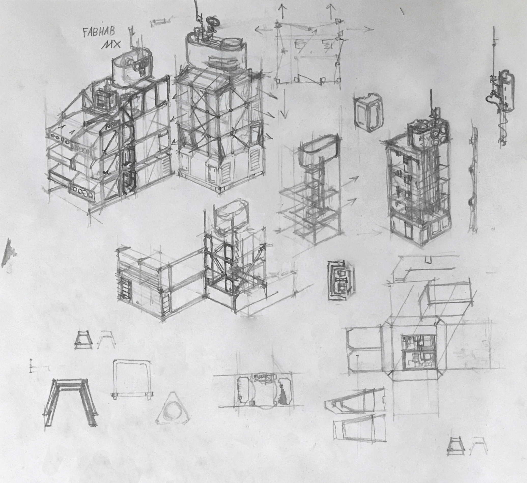
The FabHab. Cheap modular housing for general colonial purposes. Hugh casually mentioned styrofoam. I know everything that needs to be done. The Metabolism architecture movement and the Nagakin Tower in particular serve as inspiration. All I need to do is to make a more cruel version of it. That, and a catchy name. Jack suggested FabHab. Pre-Fabricated Habitat. Perfect. Ship it.

Holiday merch store discounts coming soon
Later in December we’ll be reducing the prices of all our items, including all the pewter miniature models, from mid-December until mid-January. If you’d like to support our development, consider picking up an SNC Zippo or a t-shirt. We'll announce via our Discord server and all the other usual places when the price drops are live.
Thanks for reading.

Get Brigador Killers
Brigador Killers
Isometric power fantasy
| Status | In development |
| Author | Stellar Jockeys |
| Genre | Action, Shooter |
| Tags | Cyberpunk, Dystopian, Isometric, Mechs, Music, Retro, Sci-fi, Singleplayer, Top-Down |
More posts
- BRIGADOR KILLERS: THE COMBAT BUILD6 hours ago
- Beauty renders in the inventory screen10 days ago
- A Quick Look At The Latest Brigador Killers Build41 days ago
- Updating our plans for June71 days ago
- Your Reactions To Pilgrim Two Weeks OnMar 28, 2025
- Brigador Killers: Pilgrim Is HereMar 11, 2025
- Our Plans For The First Half Of 2025Feb 27, 2025
- Ghost LightsJan 30, 2025
- Meet the Teddy BoyDec 20, 2024
- Crash Test Dummies In Brigador KillersNov 28, 2024
Comments
Log in with itch.io to leave a comment.
I love this kind of update